Monday, 30 May 2011

Tim Hetherington


I've been thinking about Tim Hetherington for awhile. You may remember he was in the news recently as he was killed whilst in Libya. The Times magazine also featured some his work recently which I was moved as it was so honest and beautiful.

The work I am refering to is Sleeping Soldiers. Hetherington documented these soldiers whilst sleeping when they are most vulnerable and perhaps arguably innocent and defensless. These photographs make up the book Infidel.

"The book Infidel and film Restrepo are about the intimacy of war," explained Hetherington in an interview inThe Independent. "And that's what I see when I see the photographs of these guys sleeping. We are used to seeing soldiers as cardboard cut-outs. We dehumanise them, but war is a very intimate act. All of those soldiers would die for each other. We're not talking about friendship. We're talking about brotherhood.

The film of Sleeping Soldiers can be seen here.

I also watched Diary by Hetherington, which he made after ten years of documenting war as an "attempt to locate myself after ten years of reporting". I found these videos highly moving and haunting. Watching them, I felt fearful and shocked at the brutality of war which is Hetherington does not sugar-coat. Watching these films, I also wondered how he got by in these situations of war as he was a Westerner and begun to wonder about the horrors that he had seen yet was only showing us a edited version. What struck me was his bravery to go out and photograph and film as a way for him to understand the atrocity of war yet still create something beautiful but not in an awful glamourous way.

It's a terrible loss, but not in vain as Hetherington's work shed new light on the truth of war that we cannot take for granted.

And I can only wish for the safety and health of those directly involved in conflicts all over the world.

Tuesday, 12 April 2011

You know I enjoy logos


I stumbled upon this little gem on Ffffound. I think it speaks for itself. Actually, let me say something, I thought it was so peculiar that Pepsi started as 'swirley' like Coca Coloa and now it is all refined, light and geometric, sans serif...basically VERY different. And how many changes can one brand go through!

James Taylor is another one....


Seriously, this guy has got it going on at the moment. Of Debut art, his work is really colourful and brilliant but it isn't childish or cliche. Just really nicely sophisticated.

I reckon you will see even more of him...

Hello...bit long- I know. Sorry.


I'm a bit obssessed at the moment...
I don't know what it is, but I keep seeing and saving tears of lovely letterforms. A bit geometric and patterned. I really like the development of the "Sea Smoke". I personally always wonder how you begin to draw things like that and now I know! Mmmmm...


Tuesday, 29 March 2011

Art+Protest

This Saturday, over 500,000 people went on protest against the cuts that the Con-Dem government is making at the moment in the public sector.

The was a serious array of a amazing, funny and witty placards that were made to highlight the public's anger, frustration and disappointment in the government.

Here are a few which made my cut. If I was able to put them all up, I happily would.

Images were taken by Sean Hick, Emerson Povey, Sarah Honeysett, Tamsin Chapan, Leticia Tootington and Danny Birchall.


Friday, 11 March 2011

READ THIS

Only by accident did I discover this. I was looking up work by an art director at Widen+Kennedy.
I'm not really sure how I stumbled on this.

serendipity is a beautiful thing.

This is the funniest thing I have ever read. Just brilliant.

Travel Blog - Mr & Mrs Smith Boutique & Luxury Hotels

Tuesday, 8 March 2011

Nice football art- that I can tolerate.


There is only a certain kind of football art/ memorabilia I like/ can tolerate. Like this.

Printed by Blam from Print-Process and designed by Jeff Knowles, Art Director at Research Studios.

I've put up four, but there are plenty other teams.

"Come on ...........!"

Monday, 28 February 2011

Friday, 25 February 2011

The Typographic Circle presents Morag Myerscough


Morag Myerscough can be my Queen whenever she wants. The lady is a maverick, I would say free spirit here, but I feel like those words aren't strong enough to hold her strength of character.

For those of you who don't know, Morag was one of last year's New Blood judges. If I remember correctly, she was on a green background

It's easy to be different and to not want to be part of the crowd and by trying to be an individual you really can set yourself up for failure. But that is what I liked about Morag, she is succesful, like really successful and flipping creative. She does things because she wants to and they work. She reuses things and creates on very low budgets, and sourcing from Ikea and ebay. She doesn't waste a good idea quote.

She started with her likes or rather obsessions, like tomatoes when her three plants yielded 800 (I think) tomatoes last summer. There were several photos of tomatoes of different varities arranged in a spider and a car and other such shapes. Sadly she didn't get time to make chutney.

Morag doesn't just have interests and work; she lovingly and wuite passionately combines the two. She paints, a lot and in her work to she paints. Many of the exhibition she has done have been painted by her and her assistants. And that's another thing, which I found quite surprising. Morag, get her hands dirty and rolls up her sleeves often with her mate Luke, who builds and paints too and her dog, Lemmy. Why does she do it herself? Well, so that they ideas can come to fruition and because of the often tiny budgets for the work she does.

And see the lovely poster, No Airs and Graces, it has been cut and pasted. If you don't know what that means, ask an older designer. I have only ever heard of it and have yet to do it myself. But that they beauty of the low tech (possibley cheaper but NOT CHEAP) way Morag works, it works. It feels right. Even when she was stapling captions with hand drawn stencil lettering on them at the last minute before the exhibition opened, it looked and felt right. Another great example was the Africa exhibition by David Adjaye. These photos, yep those, printed at Snappy Snaps. I kid you not and hanging on the ceiling is tissue paper which makes the exhibition for intimate and focused because the "ceiling was too high".

It the little things with Morag and the really big things. All the exhibitions have models made and the client at the exhibition collected coins.

There is just one more thing that is worth mentioning.

For this work, Morag did for the Westminster Academy, I was charmed by what she said about why there was not wayfinding in the building. Part of it, is that Morag does not like wayfinding too much and another part is that, if someone of the street walks into the academy, why would you want them to be able to find their way around the school. For anyone who goes to the school, they know where everything is and for any official visitors, they will be shown around the school. Quite right really.

I could and in fact would like to wax lyrical about Morag Myerscough. She is the bomb, the s**t, the biz, the deal. And she is real and herself and really bloody taleneted. Especially with her 1920's bob and red lipstick.

Supergroup.

Friday, 18 February 2011

FUNK HIP HIP JAM BEATS ON THE MOVE.

Take Two

By carly.elisabeth.loveheart

Look as this cat's face

Awesome views

WOULD YOU LOOK AT THIS


My heart is racing.

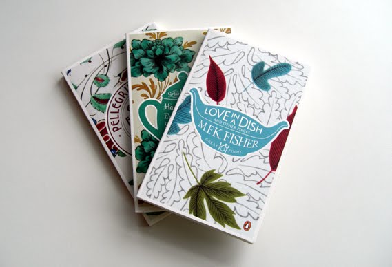
I love food. I love books. I love book covers. I love type. I love colour.

Check these out, available from April 7, from Penguin. Designed by Coralie Bickford-Smith. Can she do no wrong?

BEAUTIFUL TYPE.

I feel quite startled.

I am literally in AWE.

Wednesday, 16 February 2011

Just How Open Is Your Internet?


Just How Open Is Your Internet? [INFOGRAPHICS]

This is quite frightening yet surprising. Clearly a lot of developing countries do now have any censorship or surveillance because they don't have access to the internet.

All the 'modern and civilised' societies have some censorship and are tolerable and acknowledge people's human rights and freedom. But why oh why is Australia 'under surveillance' and what exaclty does 'persuasive censorship' mean?

Tuesday, 15 February 2011

Black Swan by Rodarte


I just wanted to pay homage to sisters Kate and Laura Mulleavy of Rodarte, for their beautiful creations for Black Swan.

Where Peregrines Dare! | Tate Blog

Where Peregrines Dare! | Tate Blog

Monday, 14 February 2011

Nike Advert

I saw this awesome Nike advert the other on the telly box. When I find it in all it's glory I am posting it!
Just do it.

Tuesday, 8 February 2011

Chrysler Eminem Super Bowl Commercial - Imported From Detroit


Goosebumps.

Floods in Australia

So with all the devastation going on around the world, it is difficult to really get a sense of scale. Take Australia and the horrendous flooding. Australia is much bigger than Great Britain and so to comprehend the devastation is beyond ones own realms of experience of space. But when you see it like this, I think you can easily assess the magnitude of the flooding.

Furthermore, and I don't mean to glamourise other peoples suffering, I think the way that this has been illustrated is very effective and really hits home the reach of flood waters.

Development: Jim Whimpey and Andrew Kesper
Executive Producer: Matthew Liddy
Source: NearMap

Courtesty of Jamin via Twitter.

Happy Birthday Jules Verne


Look at this fit Google logo!