Showing posts with label Art direction. Show all posts

Thursday, 3 February 2011

MASA at Breed London


I'm doing some research for the next issue of Modus and although this is nothing what I need, I am quite drawn to MASA's work.

He is Latin American, born in Venezuala and I think this comes across in his work, certainly the vibrancy and the energy.

I adore South America and would go back in a heartbeat, just the edgy, colourful and buzzing vibe of the place is just beautiful. I will dig out some photos of signs and graffiti that I took when I was there to show you.

Cheers.

Tuesday, 1 February 2011

Black Swan posters


To along with Darren Aronofsky's new film, Black Swan, are a series of beautiful illustrated posters by La Boca.

You can read a full review and analysis of them by Paul Owen of The Guardian that fully illustrates the influences and strengths of the posters.

The fourth poster reminds me of Bob Staake's cover for the New Yorker regarding the BP oil spill. And I can't help but think of geometric Russian Communist posters like this by Alexandr Rodchenko.

In terms of typography, as Owen points out, there is a strong sense of old ballet adverts. But I also think that that style of typography is all around us at the moment. For example, Tilda Swinton's I Am Love.

As I have said before about certain things I post, I love a stripped back minimal poster in todays madness of poster here and there and advertisements left right and centre. To me this stands out miles with the limited colour and overall dark tone of the posters. And as Nina battles the Black Swan within her, the White Swan that she is is being overwhelmed and dominated as shown in the posters. The Black Swan is a strong and forboding presence in the posters and in the film and that is all I will say here about the film.

Monday, 24 January 2011

SS2011


The 70s is back this Spring Summer 2011. Watch this space.

M&C Saatchi promotes Dixons


Two years too late, but this is too funny an idea not to talk about.
M&C Saatchi tap into why people might shop at Dixons and not, let's say Selfridges.

It's cheaper. And to some extent, you are not tapping into their ideal of themselves. But then you are, Dixons is cheap and easy, and dare I say there is bad service, but then you get bad service everywhere

Still, back to the ads, they is way the red juts into the droll narrative, feels to me like someone shoving their elbow in and barging someone but in a good way. It's for Dixons, they are the opposite of the 'posh' and 'elegant' retailers they are in competition with.

Sunday, 16 January 2011

The King's Speech


I am obsessed with this film at the moment after talking about it incessantly and finally seeing it this saturday. Watch this space for a review and a declaration of my love for Colin Firth.

I decided to embark on a little research and stumbled on these beauties. And if you have seen the film, you will definately enjoy these or at least find them interesting and insightful.

http://www.britishpathe.com/record.php?id=50494
http://www.bbc.co.uk/archive/ww2outbreak/7918.shtml

Tuesday, 11 January 2011

Nikki's hair


In Misfit's, Nikki, played by Ruth Negga, always has really cool hair.

And for those who do not watch Misfits, you should. I could wax lyrical about it but I won't. However, there is something about that works even though it shouldn't. Does the idea of chavy sort of scummy people picking up litter on a council estate crossed with Heros and a bit of Skins (at times, Misfits is a little bit raunchy) sound like TV awesomness?
It is.

Friday, 17 December 2010

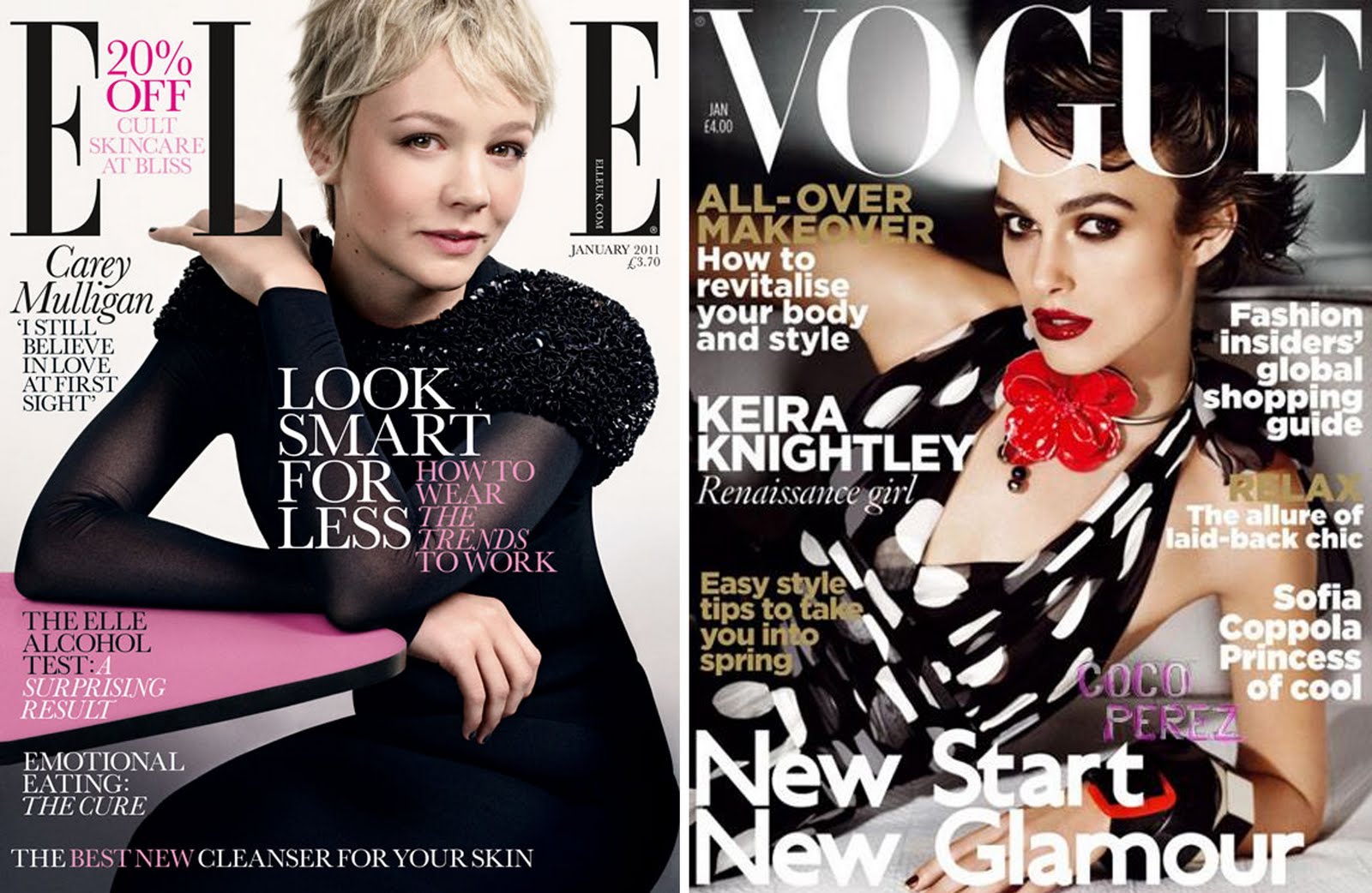
January looks fit


The illustrations are done by Belgian illustrator Gwénola Carrère.

Wednesday, 15 December 2010

Tuesday, 23 November 2010

I am in love


I love Mediterranean food and I love Italian food. Part of the reason is the social history of the food. I love the idea of all the mums and dads and aunts and uncles and grandparents in the kitchen starting from scratch, cooking what was available to provide for their families. And just seasonal produce. I also love the regional part of Italian food, that the people in the North do not eat the same as the people in the South and visa versa.

So there is my love of Italian food and I heard about this book ages ago and didn'y make a proper note of it, but then I came across it again and gosh! There's a website too, http://www.geometryofpasta.co.uk/ .

I am so getting this book.

From a design point of view, I think it is quite beautiful. Just the really simple clean aesthetic with one colour graphics. Food books cans often can get really cluttered and as someone who has done a food book,http://bellaswork.blogspot.com/p/all-i-want-is-decent-home-cooked-curry.html, it can be difficult to decide where you are coming from and what you want to say about your food. Also, to illustrate food is something unto itself. Do you always want to completed plates of food?

Nigel Slater's Tender has some beautiful photography. Some of the shots of the ingredients are luxurious. The photographs are so dark and heady but then have areas of rich colour. Nigel is very involved with the art direction of this books.


I would also check out Robert Festino, who I mentioned before.

Monday, 22 November 2010

Food porn


a la Robert Festino

The second image reminds me of Nigel Slater's Tender- Might do a post of that.